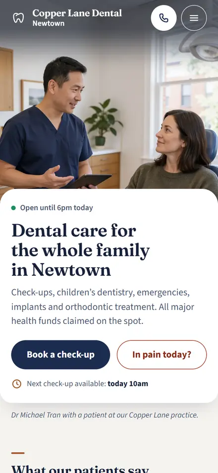
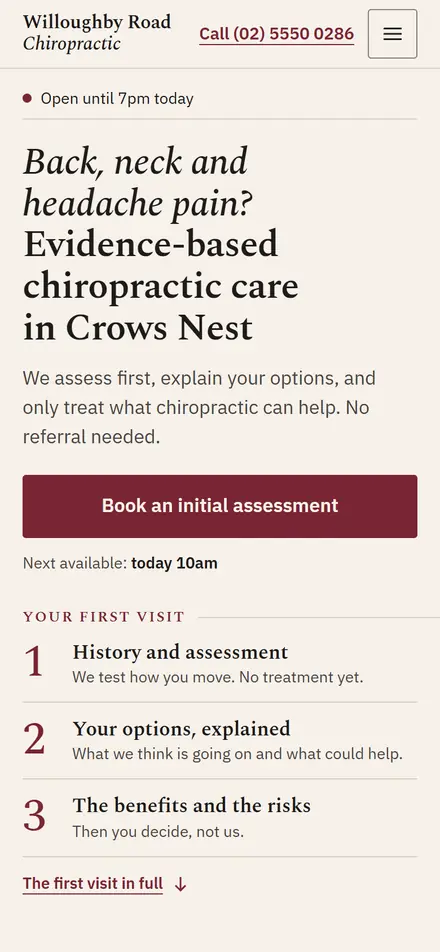
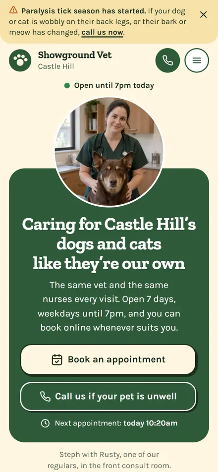
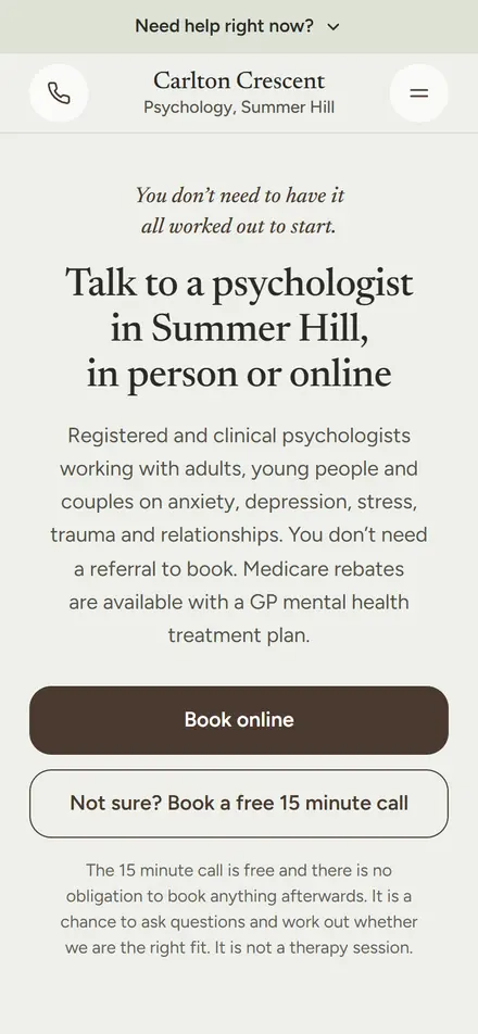
Anatomy of a clinic homepage: 17 decisions and why we made them.
A concept for a Marrickville physio, rebuilt for the phone. The practice is fictional; the decisions aren’t. Top to bottom, here is every piece, why it’s there, and what it’s doing for the patient who lands on it.
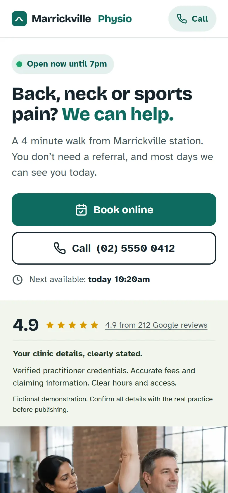
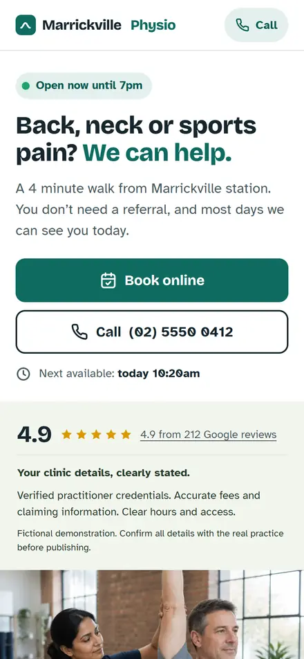
1. Top bar
The clinic name and a Call pill. Nothing else.
- Phone leads convert several times better than forms for local services, and older patients still prefer to call.
- No menu. On a phone, a menu is one more tap between the patient and the booking.
- The bar sticks, so Call is a thumb-reach away all the way down.
2. Open-now pill
“Open now until 7pm”, worked out live from the hours.
- Answers “can I actually get hold of them” before they’ve read a word.
- A site that knows the time reads as a clinic that’s on top of things.
- The dot changes colour, and the words say it too.
3. Headline
Pain, then reassurance. The suburb sits underneath.
- Names the pain patients search for (“back pain”), not the treatment (“manual therapy”).
- “We can help” is reassurance, not fear.
- The first thing to A/B test: high impact, free to change.
64%of mobile visitors never scroll past the first screen
4. Subhead
Station, no referral, and “most days we can see you today”.
- “You don’t need a referral” is physio’s single most common objection. It sits above the fold on purpose.
- Suburb and landmark for local intent.
- Written at a grade 6 to 8 reading level, in “you” voice. Health pages convert best there.
5. Two buttons
One solid Book online. One outlined Call, with the number on it.
- One dominant colour, so there’s no question which action the page wants.
- Call is a button, not a text link, and the number can be read out or written down.
- Buttons above the photo. The action outranks the picture.
56pxtall. A patient in pain on a small screen is not a precise tapper
6. Next available
“Next available: today 10:20am”, from the booking calendar.
- The page answers “how fast can I see you” with a real time, not a promise.
- On the live site this pulls from Cliniko, Nookal or Halaxy.
- The slot they just saw is waiting when they tap Book.
7. Trust bar
Stars and the clinic’s essentials, inside the first screen.
- Straight under the hero and above the photo, so the rating is visible on a 375px phone without a scroll.
- Credentials, fees and claiming, hours and access: each promised here and answered further down.
- On your site it carries your real registration and funds, in words rather than logos. Text loads instantly and logo use has rules.
75%of patients won’t book below 4.0 stars. Half won’t use a business with under 20 reviews
8. The photo
One real photo of the actual physio, captioned. Or none.
- People skip stock photos. The caption says this one is real.
- Landscape, about a third of the screen. A portrait photo eats half of it.
- No carousel and no hero video: the page has to load fast on mobile data.
9. Conditions grid
Eight tiles named by the pain, and a “not sure” tile for everyone else.
- Each tile is the front door to a page written for that condition.
- “Lower back pain”, not “spinal mobilisation”.
- The heading is a question, because the patient is the one with the answer.
2 to 4×better conversion from condition pages than a generic services blob
10. How it works
Three steps, then a “from” price and the rebate.
- “No referral needed” and “today or tomorrow” spelled out in step one.
- Step two answers “what actually happens”, which is what patients fear more than the treatment.
- The price box shows what a first visit and a follow-up cost, and how claiming works. Nothing more.
11. Team
Three real faces, large. Bios short and specific.
- Patients spend their time on faces, not paragraphs, and a bio helps them choose deliberately.
- Credentials that mean something: “APA Titled Sports and Exercise Physio”, not “highly experienced”.
- Each bio names conditions, so a patient with a knee can pick their physio.
12. Practical details
Good to know before you visit, in four short cards.
- Getting here, the first appointment, fees and claiming, and a phone alternative.
- In the example the cards describe what belongs there. On your site they carry your parking, arrival and fee details.
- Fees and eligibility stated accurately, never a promised rebate.
13. Location
Address, hours, map and parking, matching the Google listing exactly.
- A mismatched name, address or phone number hurts local ranking.
- Today’s row is highlighted by the same clock as the open-now pill, so the two never disagree.
- “Where do I park” is a real reason people don’t book, so the street, the time limit and the buses are spelled out.
14. FAQ
Six questions, in the order patients worry about them.
- Cost and rebates first, because cost is the top anxiety. Then referral, will it hurt, how soon, what to bring, how many visits.
- Accordions keep the page short: six lines to scan, not six paragraphs.
- “Will it hurt?” is answered honestly, and the section invites a call: “We don’t mind.”
15. Final Book and Call
The warmest lead on the page shouldn’t have to scroll back up.
- A patient who has read everything is ready. Book and Call are right there.
- It names Jess on the front desk. A named human beats “our friendly team”.
16. Sticky bar and booking sheet
Book and Call stay in reach. Booking opens in a sheet, not on another site.
- Once the hero buttons scroll away, a bar holding Book and Call takes the thumb zone.
- Pick a physio, a day and a time. Taken times are crossed out, not hidden.
- Then name and mobile only. Confirmation comes by text, because patients trust a text over an email they’ll never open.
5 to 12%lift in mobile conversions from a sticky Book and Call bar
17. Under the hood
The whole page, five photos included, weighs about 280 KB.
- 53% of mobile visits abandon past three seconds. This one loads in well under that.
- 17px body text, tap targets 44px and up, no pop-ups on arrival, reduced motion respected.
- Atkinson Hyperlegible for body copy, designed for low-vision readers, which suits an older patient base.
280 KBfor the entire page, fonts and all five photos included