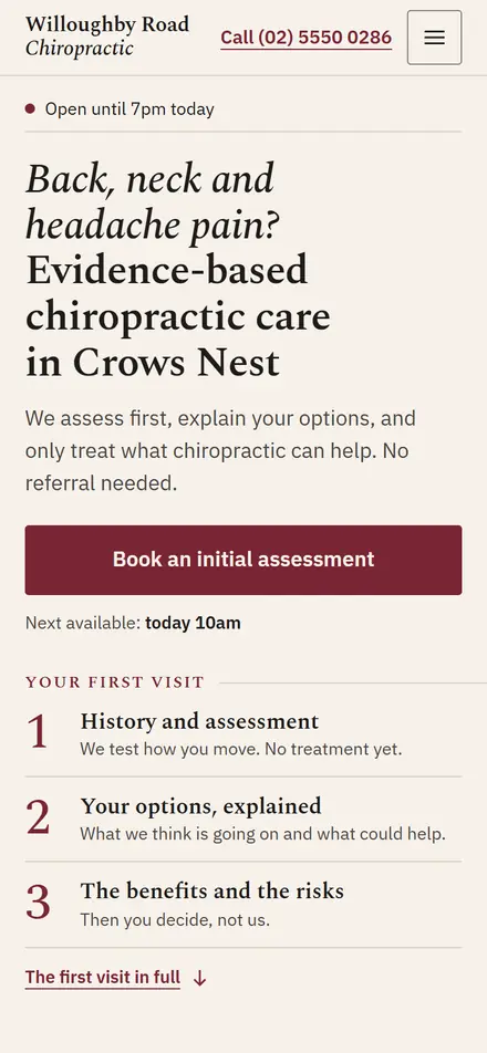
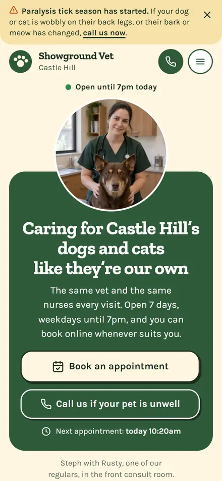
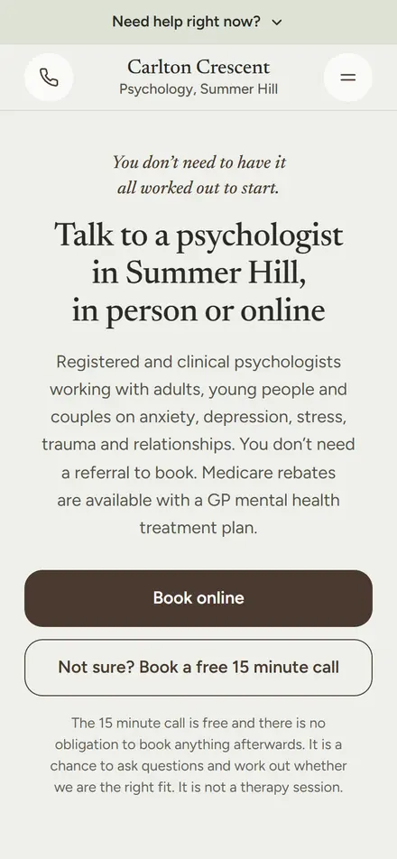
What a clinic homepage actually needs: the 12-point checklist
bdog builds websites for clinics. This is the list we rebuild every homepage against.
On This Page
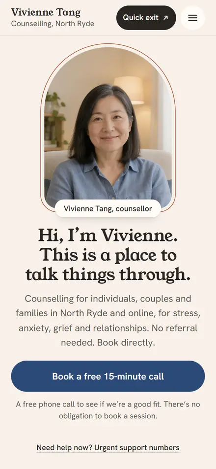
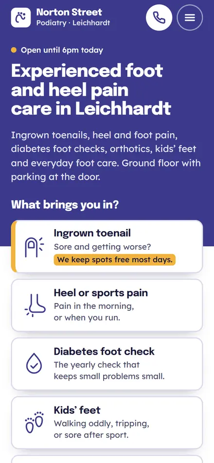
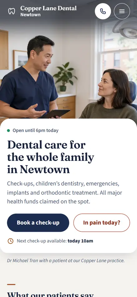
Open your clinic's website on your phone. Not your laptop. Your phone, on mobile data, standing up.
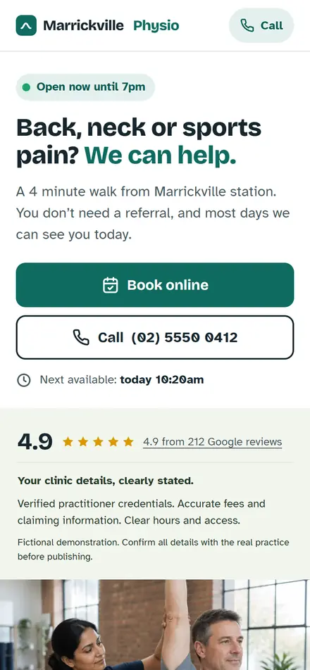
Can you see a phone number without scrolling? A Book Now button? Your suburb? If you can't, most of your patients can't either, and most of them are on a phone.
That's the test. The twelve points below are what passes it, in the order they should appear.
The first screen
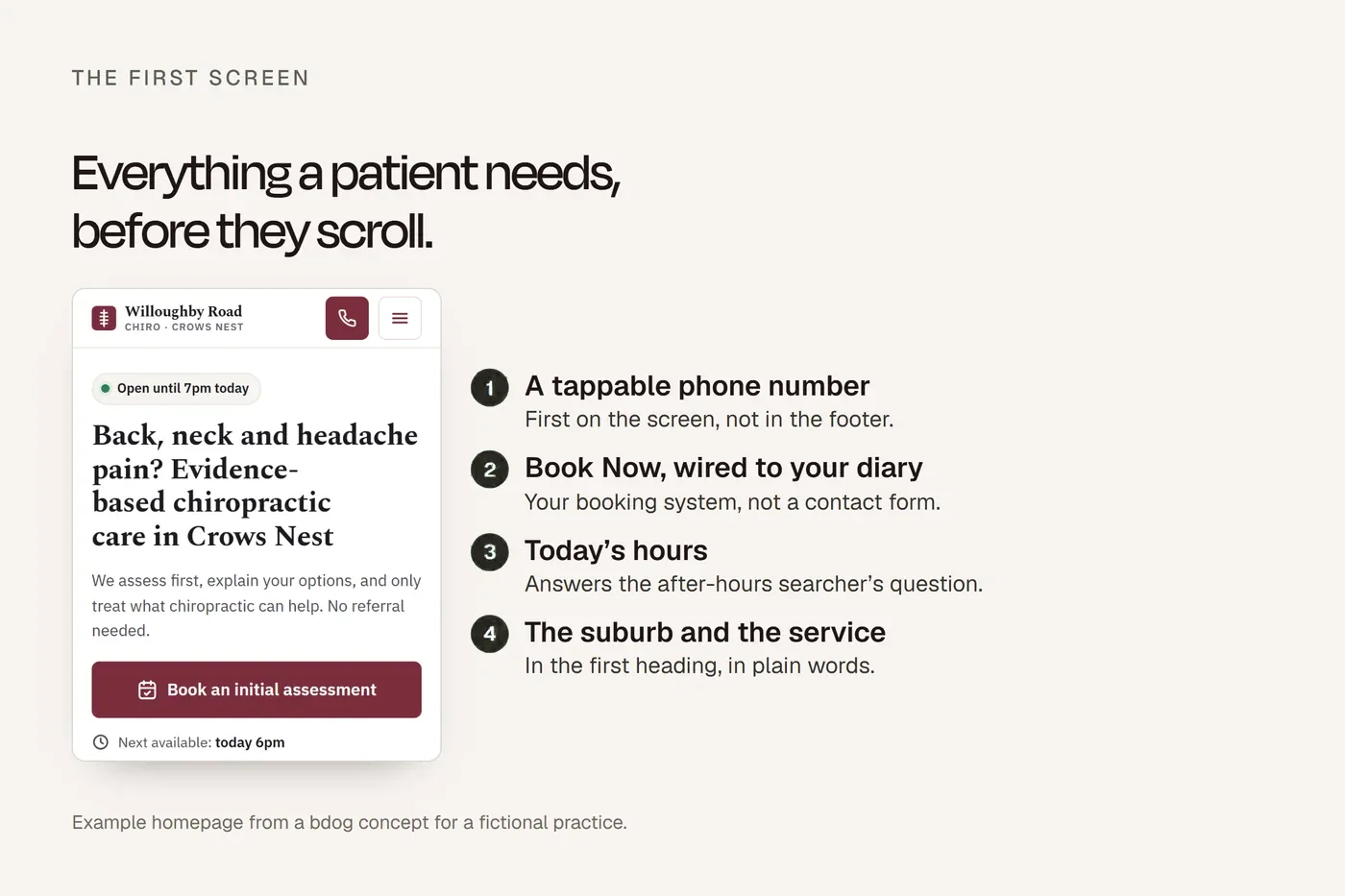
Everything a patient needs to act should be visible before they scroll. On a phone that's about the top 600 pixels. Three things go there and nothing else competes with them.
1. Your phone number, tappable
First thing on the screen. Not in a menu, not in the footer. A patient in pain, or a parent with a sick kid, wants to ring. One tap. Make it a link so it dials.
2. Book Now, wired to your diary
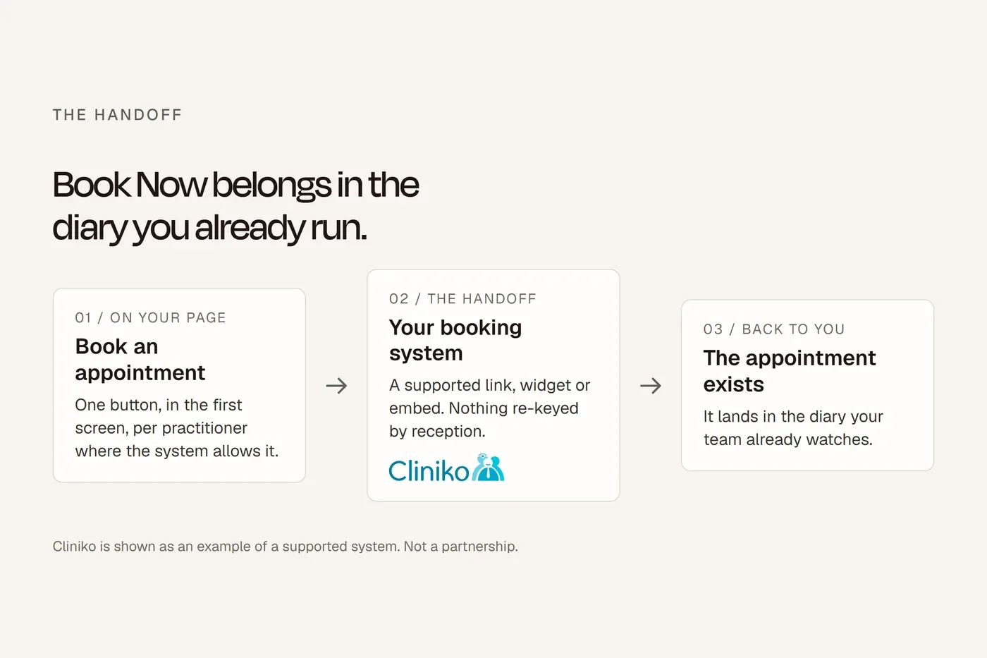
Beside or beneath the phone number. It opens your actual booking system: Cliniko, Halaxy, Nookal, Zanda, whatever you run. Not a contact form. Not a "request an appointment" page that someone reads on Monday. If your button sends patients to a directory to book, you may be paying a fee for a patient who was already yours. We've written that up separately.
3. Your opening hours
Under the headline. "Open today until 7pm" answers the question every after-hours searcher has. If you're closed, say when you reopen.
That's the first screen. If it does those three things, the rest of the page is a bonus.
The next screen
4. Your suburb and what you do, in one line
"Physiotherapy in Marrickville." "Psychologists in Newtown and Enmore." Plain, and the first heading on the page. Patients search the treatment and the suburb. Google matches the page that says both. Clever taglines don't get found.
5. Your services, named the way patients say them
Six to eight, each linking to its own page. "Back pain" over "spinal rehabilitation". "Anxiety" over "affective disorder treatment". If you're not sure what patients call it, look at what they type into your booking system's reason field.
6. Real photos
Your rooms. Your reception. Your people, in the clothes they actually wear at work. No stock photos of a smiling model in a white coat, and no practitioner dressed as a profession they aren't. The Ahpra rule against implying qualifications applies to pictures too. Patients can tell a stock photo in half a second and they discount everything near it.
Further down
7. Who you are
Names, professions, registration. If anyone uses "Dr" and isn't a medical practitioner, their profession sits next to their name. If your profession has no registered specialties, nobody is a "specialist". A short bio each, linking to a full one. Patients pick practitioners as much as practices.
8. Fees and funding
What an appointment costs, or a clear way to find out. Which funding you take: Medicare (and what that means for the patient), NDIS, DVA, health funds, WorkCover. Whether you bulk bill anything. Patients who can't find fee information don't ring to ask. They book somewhere that told them.
9. Where you are and how to get in
Address, a map, parking, public transport, and whether the premises have step-free access. For a lot of your patients, the last one decides whether they can come at all.
10. Nothing that breaks the rules
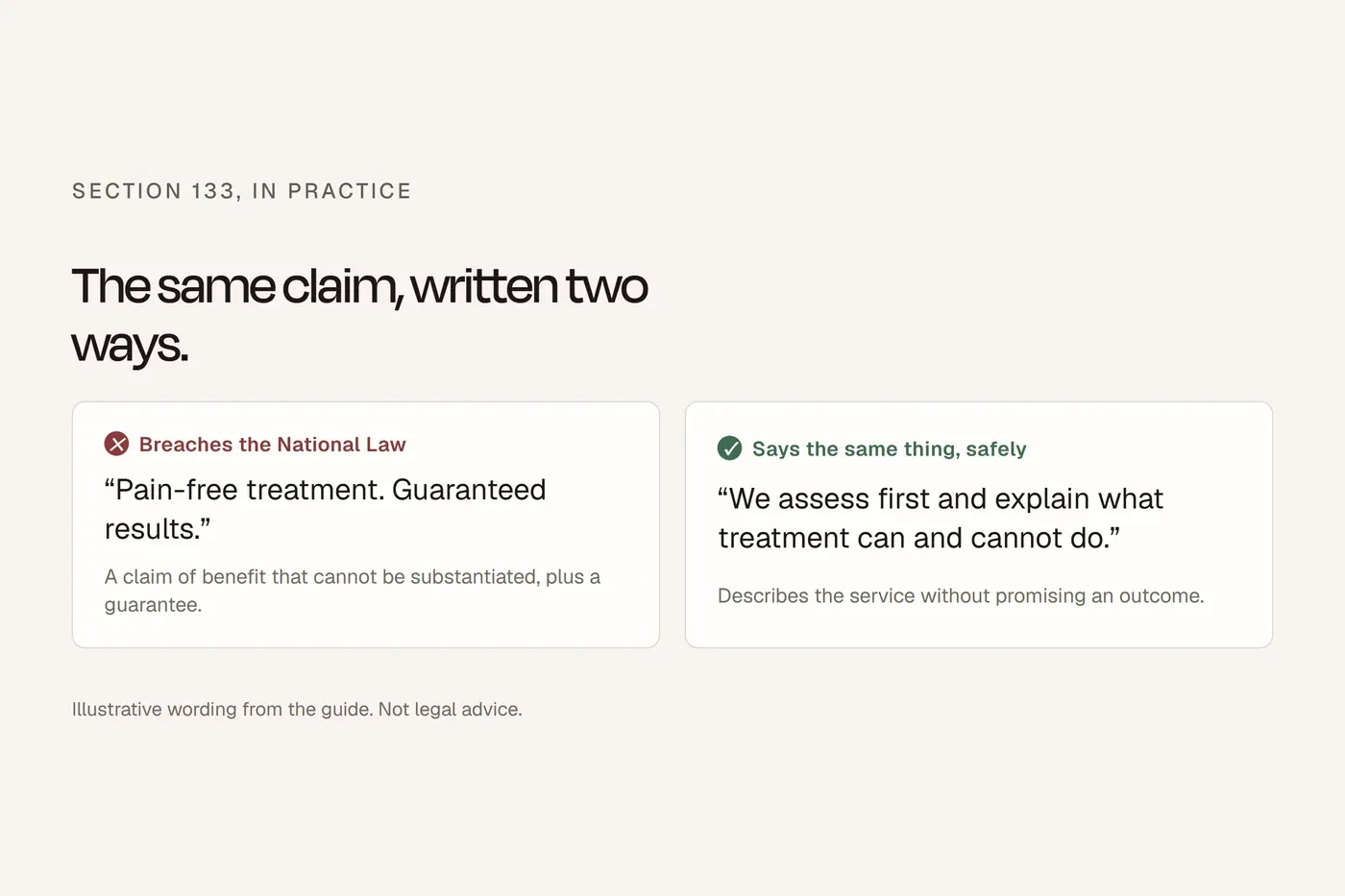
No patient reviews about treatment. No "pain-free" or "guaranteed". No before-and-after photos unless they meet the conditions before-and-after photos. No "book by Friday". You're a registered practice and your homepage is advertising under the National Law. The full checklist for this is our Ahpra article; the short version is that if a sentence would be a problem on a billboard, it's a problem here.
11. It loads fast
Test it on your phone on mobile data, not clinic wifi. If you're watching a spinner, so are your patients, and they leave. Big images, video that autoplays, and slider carousels are the usual culprits. One good photo beats five slow ones.
12. It works for everyone
Text you can read without zooming. Buttons big enough to tap. Enough contrast that the grey-on-white fashion doesn't hide your phone number. Alt text on images. The Disability Discrimination Act applies to your website, and beyond the law, a fair share of your patients have the conditions that make bad design a barrier.
What to leave off
The slider. Rotating banners that nobody waits for. They push your phone number below the fold and slow the page.
"Welcome to our website." They know where they are.
The mission statement. Two paragraphs about holistic patient-centred care that every clinic in the country could paste in. Say what you treat and where.
Autoplay video with sound. A patient in a waiting room or an open-plan office closes it, and your site with it.
Pop-ups. Especially ones asking for an email before they've seen a word.
The stock handshake. You know the one.
Testimonials. Even the ones you're allowed. A homepage with no reviews looks like a clinic that knows the rules. A homepage with reviews about parking looks like one that's trying to get around them.
The order, in one picture
Phone number, Book Now, hours. Suburb and service line. Services. Photos. People. Fees and funding. Location. Then footer. That's the page. Every homepage bdog builds follows it, and the wireframe is below so you can hold it against yours.
The explained version is above. This is the working copy.
What a clinic homepage actually needs bdog.com.au · Current at September 2026
The first screen
- Phone number, tappable, visible without scrolling
- Book Now, opens your real booking system
- Opening hours under the headline
The next screen
- Suburb and what you do, in one plain line, as the first heading
- Six to eight services named the way patients say them, each linking to a page
- Real photos of your rooms and your team, no stock
Further down
- Practitioners with names, professions and registration. "Dr" has a profession beside it. Nobody's a "specialist" unless registered as one
- Fees, or how to find them, and every funding type you take
- Address, map, parking, transport, step-free access
- No testimonials about treatment, no "pain-free", no "guaranteed", no urgency
- Loads fast on a phone on mobile data
- Readable, tappable, enough contrast, alt text on images
Leave off: sliders, "welcome to our website", the mission statement, autoplay with sound, pop-ups, the stock handshake, testimonials of any kind.
Right half wireframe, top to bottom, labelled: [Phone] [Book Now] Opening hours "Physiotherapy in [Suburb]" Services (6 to 8 tiles) Photo of the practice The team (3 to 4 cards) Fees and funding Map and address Footer
Questions we get asked
What should be on a clinic website homepage?
Phone number, Book Now, hours, suburb, services, real photos, practitioners, fees and funding, location. In that order.
Should the phone number or Book Now come first?
Both in the first screen, side by side. Older patients ring. Younger patients book. You don't get to choose which one lands.
Do I need a Book Now button if I have a contact form?
Yes. A form is a message that someone reads later. A booking is an appointment. Patients who want the second don't fill in the first.
Should I put prices on my website?
Yes, or at least a clear starting point and what funding applies. Practices that hide fees lose the patients who would have paid them.
Can I use stock photos?
You can. You shouldn't. Patients spot them, and a stock model in scrubs can imply a qualification your team doesn't hold.
How long should a clinic homepage be?
Long enough to cover the twelve points. Usually five or six screens on a phone. Shorter is better than padded.
Can I put Google reviews on my homepage?
Not ones that mention treatment, symptoms or results. Under Ahpra's rules that's a testimonial on your own advertising. Leave them on Google.
What about a video?
A short one of you saying who you are, muted by default, with captions, works well. Autoplaying with sound doesn't.
About this guide
Sources are named in the text; where the rules come from a regulator we link to the regulator, not to a summary of it. This is general information about building a website, not legal advice.